
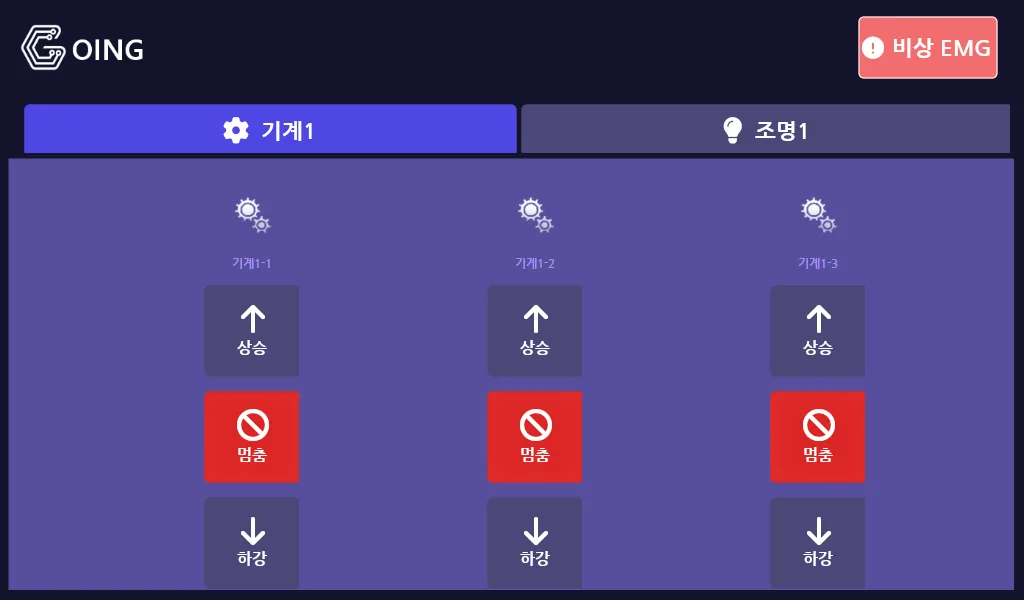
 The Midnight (indigo) theme, machine tab. GOING logo at top left, emergency EMG button at top right. Each card carries up, stop and down buttons.
This project continues into a second version: TheaterControl, a small-theatre stage control system built on SENVAS HMI. It grows from the lighting-focused first version into stage machinery control as a whole (Machine/RD), with the communication and safety models redesigned from scratch.
What we built with the Raspberry Pi touch HMI
This stage lighting control panel is a touch panel HMI that controls the lighting and mechanical equipment used on a performance stage. A 7-inch 1024x600 touch display sits on a Raspberry Pi, and the UI runs on SENVAS HMI, built on .NET 8.0 and SkiaSharp. It talks to the PLC over Modbus TCP.
Press the wrong switch on a stage and a set misbehaves. This panel is the tool a stage hand uses to switch lighting on and raise or lower machinery, quickly and intuitively. A mistake has to be obvious immediately, and a lost link has to show up at once.
The system flow is simple:
PLC slave ── Modbus TCP ── Raspberry Pi (GoingPanel app)
     ↓                              ↓
Channel state word (status reg.)   SENVAS HMI / SkiaSharp render
Board detect word (detect reg.)    → 1024x600 touch display
     ↑                              ↓
Channel event word ← user touch (up / down / stop / lamp toggle)| Item | Detail |
|---|---|
| Target device | SENVAS Touch (Raspberry Pi linux-arm64, 1024x600) |
| Host OS | Debian 12 + touch launcher service |
| Framework | .NET 8.0 + SENVAS HMI + SkiaSharp |
| Communication | Modbus TCP (custom SimpleModbusTcp) |
| Polling interval | 50ms, freshness threshold 2 seconds |
| Theme presets | 5 (Ocean / Midnight / Forest / Sunset / Mono) |
| Icon library | 11 icons x 2 (off/on) = 22 PNGs |
The software layers
The software layer design splits the code into three layers.
PageMain (around 900 lines) is the entire screen. It builds tabs dynamically, builds cards inside those tabs, and refreshes state every frame. When the board detect word read from the PLC changes, it rebuilds the card layout itself. The key idea is a signature-based rebuild: every frame it serialises the I2C addresses into a string, compares that with the previous frame, and only regenerates UI elements when something has changed.
private string ComputeBoardSignature()
{
    var sb = new System.Text.StringBuilder();
    sb.Append("M:");
    foreach (var b in Main.DevMgr.MachineBoards)
        sb.Append(b.I2cAddress.ToString("X2")).Append(',');
    sb.Append("|R:");
    foreach (var b in Main.DevMgr.RdBoards)
        sb.Append(b.I2cAddress.ToString("X2")).Append(',');
    return sb.ToString();
}
The communication manager (around 250 lines) handles nothing but communication. A background thread polls the channel state word and the board detect word every 50ms. User touch events are written into the event word, and link health is tracked through a LastSuccessAt timestamp.
The theme system (around 150 lines) exposes five colour palettes as static properties. A single Apply(themeName) call changes the background, the button colours and the icon accent colour together. Any UI code can reference Theme.UpColor or Theme.IconAccent directly.
The ON/OFF icon visualisation — rewritten four times
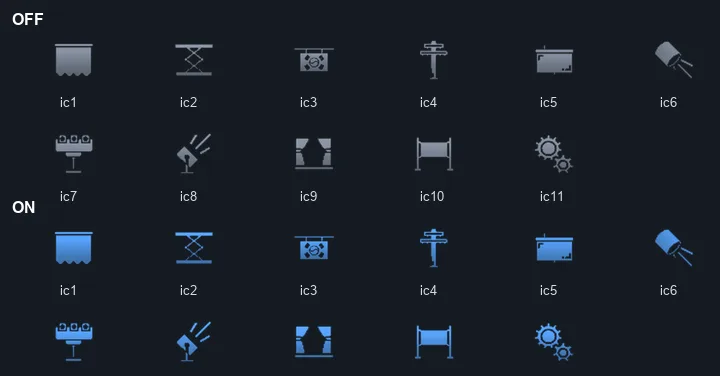 Eleven stage control icons. OFF uses a dim tone, ON is tinted dynamically with the theme accent colour.
The ON/OFF icon visualisation was the single longest task in this project. The code was never the problem; what the user actually perceived on screen was.
v1: colour alone — failed. ON in the theme accent colour, OFF in dark grey. On a dark background the OFF cards were nearly invisible. The feedback came back as “is this switched off, or is there nothing there at all?”
v2: a halo box behind ON — rejected. A translucent colour box behind the icon. It was visually distinguishable, but rejected as “it does not look good.”
v3: toggling the card background — rejected. Coloured background on ON cards only, default background on OFF. The verdict was “the cards look like they are floating.” Fair enough: with a different background per card, the grid looks ragged.
v4 (final): one uniform background, change only the icon colour. Every card and tab background is fixed to the same tone. On ON, the icon is tinted almost white (violet-100 #E9E0FF); on OFF, a dim tone (#5C5680). Text follows: Highlight on ON, faded grey on OFF.
The core of the implementation is the SkiaSharp SrcIn blend. It keeps only the alpha (the shape) of the PNG and swaps the colour at runtime.
public static void DrawTintedIcon(SKCanvas canvas, SKImage img, SKRect rect, SKColor tint)
{
    using var paint = new SKPaint
    {
        ColorFilter = SKColorFilter.CreateBlendMode(tint, SKBlendMode.SrcIn),
        IsAntialias = true,
    };
    var samp = new SKSamplingOptions(SKFilterMode.Linear, SKMipmapMode.Linear);
    canvas.DrawImage(img, rect, samp, paint);
}
Downscaling a 256x256 high-resolution PNG with Linear plus Mipmap keeps the icon clean even at small card sizes. We picked ON and OFF colours for each of the five themes and adjusted the tones eight times while looking at the real device screen. That process taught us physically that colour is not something you decide once and finish.
When the user says “the cards look like they are floating,” the designer is right. Four rounds of trial and error is still the answer.
The touch buzzer — five rounds of GPIO conflict
The Raspberry Pi GPIO buzzer for touch feedback looked simple. It took five attempts.
| # | Approach | Result |
|---|---|---|
| 1 | Play a WAV file with aplay | Silent without alsa-utils |
| 2 | Generate a WAV in code, then aplay | Rejected by the user |
| 3 | Toggle GPIO 27 PWM (System.Device.Gpio) | No buzzer on that pin |
| 4 | GPIO 18 (hardware PWM) | Already held by the touch launcher — GPIO conflict |
| 5 | Touch launcher HTTP API /api/touch-beep | Works |
Attempts one through three were simple mistakes. The real lesson came from the fourth. Two processes cannot open the same GPIO pin at once. The touch launcher service already held the pin, and our app collided with it trying to open the same one.
The fix was delegation. The touch launcher already controls that pin, so we ask the touch launcher to sound the buzzer.
public static class TouchBuzzer
{
    private const string BuzzerUrl = "http://localhost/api/touch-beep"; // touch launcher local API
    private const int MinIntervalMs = 80;

    public static void Beep()
    {
        if (/* rate-limit check */) return;
        _ = Task.Run(async () =>
        {
            try { await _http.GetAsync(BuzzerUrl); }
            catch { }
        });
    }
}
Calling this from MainWindow.OnMouseDown gives every touch and click an automatic beep. It is fire-and-forget, so UI responsiveness is unaffected.
When another service already owns a hardware resource, delegate through that service API. Using an abstraction that already exists is always faster than building a good one.
Detecting a silent disconnect
Link loss detection matters because a TCP socket can be alive while no data flows through it. Pull the network cable, or let the PLC stop responding, and TCP.IsOpen still returns true even though nothing is arriving. Showing that state as “normal” in the UI is dangerous in the field.
The solution is simple. Track the time of the last success, and if it has not been updated for more than 2 seconds, declare the link down.
// custom Modbus class — updated on every successful response
LastSuccessAt = DateTime.UtcNow;

// communication manager — link state decision
public bool LinkOk =>
    TCP.IsOpen && (DateTime.UtcNow - TCP.LastSuccessAt).TotalSeconds < 2.0;
When LinkOk is false the UI shows a red warning icon and a “link lost” label laid out horizontally in the header. When everything is healthy the icon is hidden and the header stays clean.
Do not express link health with a single boolean such as
IsConnected. Tracking the time of the last success alongside it is what catches a silent failure.
Six rounds of resource, theme and layout troubleshooting
HMI troubleshooting turned up several unexpected problems beyond the three highlights above.
Embedded PNGs rendered as red rectangles
Placeholder red rectangles appeared where the icons should be. We checked in turn whether the PNG files existed and whether image registration (AddImage) was failing, and both were fine. The answer was a mismatch in the MSBuild embedded resource name.
<!-- wrong — registers as "icons\gear_off.png" -->
<LogicalName>%(RecursiveDir)%(Filename)%(Extension)</LogicalName>

<!-- correct — filename only -->
<LogicalName>%(Filename)%(Extension)</LogicalName>
Including %(RecursiveDir) prefixes the logical name with the folder, and the runtime lookup fails.
Changing the theme left the background unchanged
We modified the current theme singleton and the screen stayed the same. Reading the source directly, the render loop referenced not that singleton but a separate custom theme field. When a library has several static singletons, you have to open the source to find out which one actually drives rendering.
Seven build errors after a UI library update
An external update to the UI library removed one style property from the button component. That is the double edge of a local ProjectReference: you can track changes immediately, and you are also exposed to them immediately.
The program registry disappeared after a reboot
A remote connection dropped and came back to find the device itself had rebooted. The cause was that the touch launcher program registry had been stored in a volatile location. Using the OS standard path (Environment.SpecialFolder.LocalApplicationData) keeps settings alive through an uninstall and reinstall cycle.
Board rescan results did not appear on the main screen
Rescanning boards from the settings page only showed the change after leaving the main page and coming back. The polling logic lived solely in PageMain.OnUpdate. Polling that has to stay alive regardless of page transitions belongs in a manager, not in page code.
The right edge of the EMG button was clipped
The rounded right corner of the emergency EMG button was cut off and looked flat. A button with Dock=Fill inside a table layout panel cell was being clipped at the cell boundary. Setting Dock=0 and specifying Bounds did not help either, because Fill was reapplied during the layout pass. In the end, giving it Margin = { Left=30, Right=30 } on both sides was the safer approach.
The SENVAS Touch deployment pipeline
In the SENVAS Touch deployment pipeline, GoingPanel runs on top of the touch launcher service. Deployment goes through a zip package.
dotnet publish -c Release -r linux-arm64 --self-contained false
→ package as GoingPanel.zip
→ upload, install and start through the touch launcher API
Persistent settings are stored on an OS standard path, separate from the app install directory. Reinstalling the app keeps the previous IP and channel settings. The stop, uninstall, install and start sequence can be automated in code through the remote management tool.

Raspberry Pi touch HMI development recap
In this Raspberry Pi touch HMI development, looking back at six rounds of troubleshooting, four rewrites of the ON/OFF visualisation and five buzzer attempts, a common pattern emerges.
You do not know until you see the real screen. However perfect a colour system looks in code, the truth only arrives once light hits an actual 7-inch touch display. Adjusting the ON/OFF tone eight times was not waste, it was the process. Because it was designed around theme variables, all five themes could be changed at once; without that, dozens of places would have needed editing by hand.
The truth about a library is in its source. Confusions like the current theme singleton versus the custom theme field are internal behaviour that no document describes. When there are several static singletons, guessing which one is really used costs you time.
Hardware resources belong to whoever holds them. Exclusive resources such as GPIO pins and sound devices should be used indirectly, through the API of the service that already owns them. Fighting for direct ownership just produces conflicts.
Always record the time of the last success. IsConnected on its own is not enough. Knowing when the last healthy response arrived is what catches a silent disconnect.
SENVAS HMI and SENVAS Touch are industrial HMI platforms we developed ourselves. Putting a touch-panel-grade UI on top of .NET 8.0 and SkiaSharp, this project confirmed that 60fps rendering and Modbus TCP communication both run reliably even in an embedded environment such as a Raspberry Pi.
A touch HMI has to be judged on the real screen, exclusive hardware belongs to the service that already owns it, and link health must be decided from the time of the last success.
The second version of this project is TheaterControl, a small-theatre stage control system built on SENVAS HMI — the follow-up that expands from a lighting focus to stage machinery control as a whole.
Contact
- Email: [email protected]
- Instagram: https://www.instagram.com/going.sen/
- Website: https://intosen.com/kr/consult/
Comments
Enter a nickname to leave a comment, or sign in with Google or GitHub.